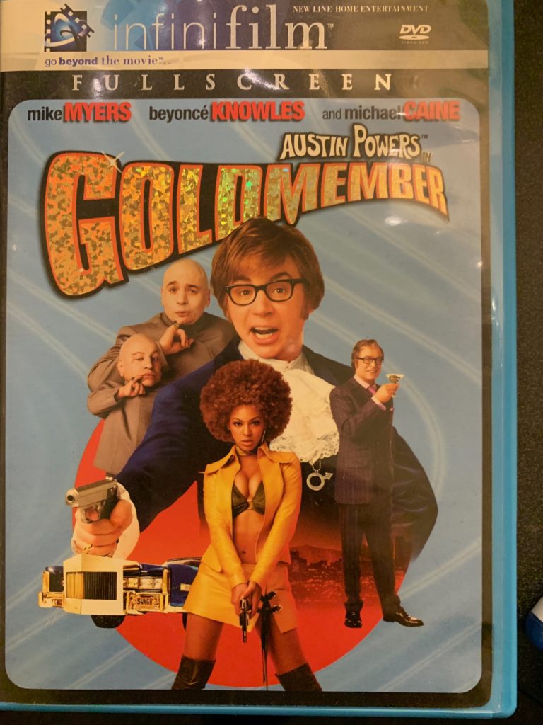


Looking at this cover the first thing you see is Beyoncé posing in minimal clothing and holding a gun while holding an attractive gaze. The way she posing and is dressed compared to the men in the photo is a way to make her more the center of attention and for buyers to be more interested in watching the movie. Which would also be a great example of the male gaze.
This is a great example of undoing gender in a cover. Deadpool is posing similar to how women pose in movies and in Ads in general. It shows the idea of how women are often shown posing in odd positions because of it being “attractive” but when men are shown doing those poses it shows how ridiclous it is to have women look a certain way in the media.

I love that you went with showing gender in movies. I feel like a lot of the time we dont notice gender in everyday lives so we dont notice it in the media we watch either. I love the Deadpool one for undoing gender, if i remember correctly they did things like that in the actual movie as well. Only downside is they are doing it to be funny when inreality “undoing” gender shouldnt be comical
I like how you focused on one aspect of media with movie covers. With the deadpool one, I like how they drew attention to the undoing of gender in reference to female poses.
I really like the connections you made with the movie covers! “The Heat” movie cover is one that definitely stood out to me the most. I remember watching the movie and thinking how most movies with these two actresses are not presented as masculine. But in this case, the whole movie put on the portrayal that two women were capable of doing and being anything, especially anything a man was capable of!